What is the ideal font size for a website?

Titles, subtitles and plain text
Choosing the right size of a font for a website is extremely important. It can make the difference between a clear website (where visitors stay) and an unclear website (where visitors quickly leave).
The use of titles, subtitles, and plain text is essential for readable content on your website, utilizing a fixed hierarchy. Titles are also known as headers and are often indicated with (H). Plain texts are the continuous texts and are indicated with (P).
You can often follow the following schedule in terms of size
H1 (36px)
H2 (32px)
H3 (28px)
H4 (24px)
H5 (20px)
H6 (18px)
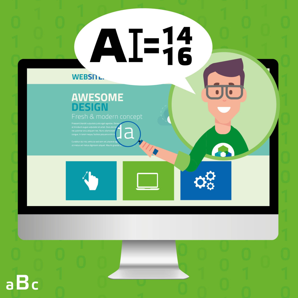
P (14 - 16px)
Plain text is easily readable between 14 and 16 px.


Adjustable font size
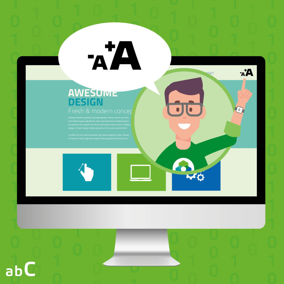
If it is useful for the target audience to adjust the font size, this is also an option.
For example, see the website of Vierstroom: https://www.vierstroom.nl/Toegankelijkheid. (With the button at the top right, you can enlarge or reduce the font size). But what about fonts and small screens (such as on a phone)? It is important for the usability of a website on different devices that a website is responsive. What that exactly means will be explained in the fact “What is a responsive website?”.
Got a fun fact? Share it with us!
Do you have a fun and interesting fact you would like to see featured? Let us know! Send us an email with your suggestion, and your fact might earn a spot on our website and social media. Whether it is a funny tidbit, a fascinating discovery, or something surprising related to our field of design and webdevelopment, we’re excited to hear your ideas. Your submission could soon inspire, inform, or simply bring a smile to others. So don’t hesitate: share your fact with us and you might just see it showcased on our channels soon!
Do you not check our website daily for the latest tips? No problem! You can also follow us on our social media channels. We regularly share updates, useful facts and a behind-the-scenes.