What is a responsive website? We explain it!
6 February 2025
Stefan Grevelink

A responsive website is essential for a successful online presence today. But what does that exactly mean? In this blog, we explain how a responsive website works, why it's important, and how to make your site mobile-friendly. Discover the benefits, the impact on your Google ranking, and practical steps to optimize your website for all devices!
What is a responsive website?
A responsive website automatically adjusts to the user's screen size, ensuring it looks good and functions optimally on desktops, laptops, tablets, and smartphones. Good readability is crucial for a pleasant user experience; text should be readable on a smartphone without zooming in, while the layout should remain organized on a desktop. Responsive web design prevents frustration and helps visitors quickly find the information they need.
How does responsive web design work?
Responsive web design uses a combination of flexible grid layouts, images, and special code to define how a website looks on a phone, tablet, or computer. These techniques ensure that the elements of a webpage adjust to the available screen space. For example, a three-column layout on a desktop can automatically switch to a single-column layout on a smartphone for better readability and navigation.
Benefits of a mobile-friendly website
A mobile-friendly, responsive website is a must-have today. It provides an optimal user experience, increases conversions, and keeps visitors on your site longer. Moreover, it's easier to maintain and future-proof. Discover why responsive design is crucial for online success!
-
Better user experience
Users don’t have to zoom in or scroll horizontally to read content. -
Higher conversion rates
A user-friendly site leads to more engagement and purchases. -
Lower bounce rate
Visitors stay longer on a site that works well on their device. -
Easy maintenance
Instead of managing multiple versions of a website, only one website is needed that adapts to all screen sizes. -
Future-proof
New devices with different screen sizes can easily display the site.
Why Google rewards responsive websites with better rankings
Google values mobile-friendly websites and rewards them with higher rankings in search results. This is because Google aims to provide the best user experience, and responsive websites perform better on mobile devices. Since the "mobile-first indexing" update, Google primarily evaluates the mobile version of a website to determine its search ranking.
How to test if your website is responsive
There are different ways to check if a website is responsive: using Browser Developer Tools or manual testing. We’ll explain what to look for and what options are available.
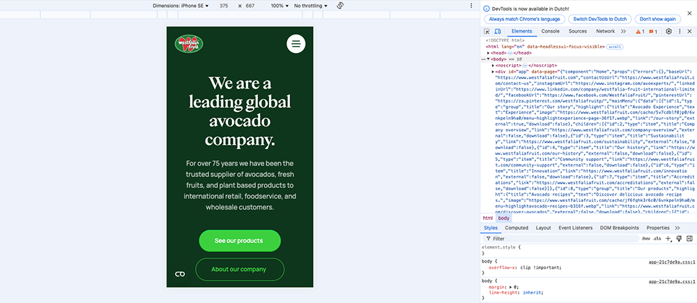
1.Browser Developer Tools
Most modern browsers, like Google Chrome and Firefox, offer built-in developer tools that let you test your website's responsiveness without external software or physical devices. By pressing F12 and enabling the Toggle Device Toolbar, you can:
- Switch between different screen sizes such as smartphones, tablets, and desktops.
- Set custom screen resolutions to test how the website adapts to non-standard devices.
- Check the viewport and zoom levels, helping to spot scaling issues.
Additionally, the developer tools offer more insights:
- Network and load time analysis: Test how fast your website loads on different network speeds (e.g., 3G, 4G, or slow Wi-Fi).
- Touchscreen interaction simulation: Check how buttons, menus, and swipe functions respond on a touchscreen.
2. Manual testing
Although developer tools offer a quick and convenient way to check responsiveness, manual testing on real devices is essential. This gives a realistic view of how your website actually performs in different environments.
-
Test on various devices and operating systems
For reliable testing, open and use your website on smartphones, tablets, in both portrait and landscape modes, and desktops & laptops. Keep in mind that each operating system and browser (e.g., Chrome, Safari, Firefox, Edge) can display the website slightly differently. -
Check key user elements
While testing, pay attention not only to how the website looks but especially to the user experience (UX). Here are some essential points to check:- Readability: Is the text easily readable without zooming in? Is the font size and contrast appropriate?
- Navigation: Do menus, buttons, and links work intuitively? Are dropdowns and sidebars easily accessible?
- Buttons & interactions: Are buttons large enough to tap easily? Do they respond quickly?
- Images & media: Are images and videos scaled correctly and loading without delay?
- Forms & input fields: Are text fields, checkboxes, and buttons easily usable on touchscreens?
- Readability: Is the text easily readable without zooming in? Is the font size and contrast appropriate?
- Navigation: Do menus, buttons, and links work intuitively? Are dropdowns and sidebars easily accessible?
- Buttons & interactions: Are buttons large enough to tap easily? Do they respond quickly?
- Images & media: Are images and videos scaled correctly and loading without delay?
- Forms & input fields: Are text fields, checkboxes, and buttons easily usable on touchscreens?
-
Test on different networks and speeds
A responsive website should work well not only on fast Wi-Fi but also under less ideal conditions. Try your site on various networks: Wi-Fi, mobile internet (4G/5G/3G), and offline mode to see how the website handles temporary network interruptions. -
Test different interaction methods
Websites are not only operated with a mouse or trackpad. Also, check interaction via touchscreens, keyboards, and stylus or pen. This ensures your website is accessible to a wide audience.
Steps to make your current website mobile-friendly
A responsive website is essential for an optimal user experience and better search engine visibility. By choosing a responsive template, optimizing media, and improving loading speed, you can ensure your website stays fast and accessible. Additionally, simple navigation, readable text, and regular testing play a big role in user-friendliness. Follow these steps to make your website suitable for all devices!
-
Use a responsive template or theme
Choose a website theme specifically designed for mobile-friendliness. This only applies to WordPress websites. -
Optimize images and media
Use flexible images and videos that adapt to different screen sizes. -
Improve loading speed
By reducing image sizes, using browser caching, and simplifying code (CSS and JavaScript), you can speed up your website. -
Simplify navigation
Make sure menus and buttons are large enough and work well on touchscreens. -
Use larger font sizes
Text should be readable without zooming on mobile devices. -
Test regularly
Keep testing and optimizing your website to improve the user experience.
By following these steps, you ensure that your website not only performs better in search engines but also provides a pleasant experience to visitors, no matter what device they use.

Want to learn more?
Contact Stefan!
Do you not check our website daily for the latest tips? No problem! You can also follow us on our social media channels. We regularly share updates, useful facts and a behind-the-scenes.